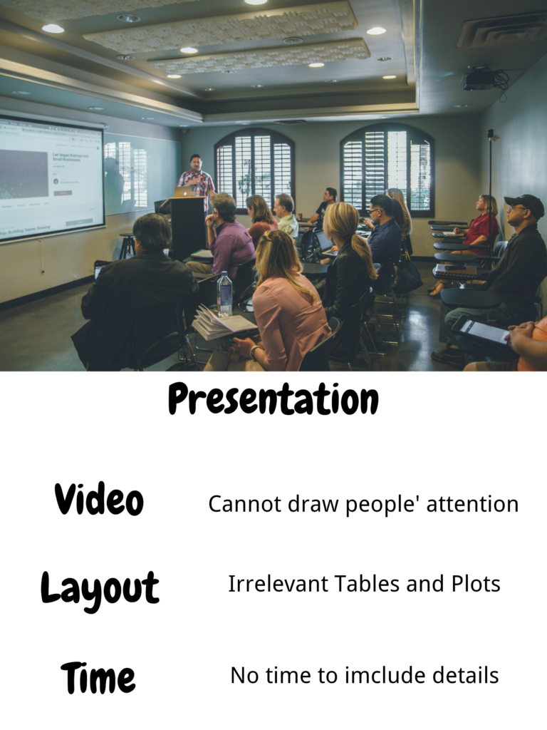
The worst presentation I have ever given was in last semester. It was a Maths final project presentation about the population model of the whooping cranes. There are three main reasons that the causes the bad presentation.
First of all, when I was introducing the whooping crane, I chose a scientific video to explain the content. Although the video I chose includes the main details should be mentioned about the cranes, the video is very time-consuming and relatively boring. Some of my classmates did not pay attention to the video and missed important background knowledge of my project.
Secondly, the layout of my PowerPoint is also very massy. Since I did not have enough time to prepare the PowerPoint before the presentation, I includes nearly all of the tables and plots in the draft. As a result, several important plots that shows the tendency of the population and the explaining words are not on the same slide. Since I compared three population models in total, there are dozens of plots and tables provided. As a result, lots of my classmates were confused about the difference between the models due to the massive tables and charts.
Last but not least, the timing was one of the reasons caused the failure. As I mentioned before, the video is very time-consuming. The representation was required to be finished within 15 minutes. However, the video I chose is an 6-minutes video, which took nearly half of the presentation time. As a result, I did not have enough time to describe the details of some contents which also caused confusion to the audiences.
https://unsplash.com/photos/1-aA2Fadydc
Leave a Reply
You must be logged in to post a comment.